

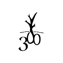
 A project that I worked for Motherlode. I created different color options for the logo and the name of the film, once the style of the font was established - green signifies the environment, gold for the economy, red for war and a neutral grey and white.
For the promotion of the film, I designed a scroll (front and back) that would look like a small poster, giving the synopsis of the film as well as an introduction to the benchmark thinkers of our time that are also in the film.
No comments:
Post a Comment